Thursday, 13 March 2014

Evaluation Question 4

How did you use new media technologies in the construction and research, planning and evaluation stages?

Construction and Research

In the construction and research stages we used a variety of new technologies to aid us in the making of our final product. When filming our trial lip syncing video we used a standard definition camera, and iMovie to edit it together, at this stage we were planning to use Final Cut Express to edit our final video together, and we were planning on using a HD camera, as this would give our finished video and much more professional outcome. The use of a standard definition camera meant that the time it took to import the video to the Mac was a lot less, meaning we could edit it together a lot quicker. Also the use of iMovie, as we all knew how to use it well, meant we could edit it quickly and have it on our blog quicker. Throughout the research element we used the Internet, mainly news websites to gain information about current trends in music videos and what videos were popular at the time, this helped us work towards making sure our video fit with the genre of the song we has chosen, while also making sure it contains elements that will appeal to a wide audience. We also used YouTube a lot, firstly as a platform to upload our trail lip syncing video, but also to view previously created music videos and one which were of a similar genre to what we wanted our one to end up like. Doing this enabled us to do an even deeper analysis into the conventions of the genre we were working with, while also giving us a wider knowledge of other types of genres.

Planning

In the planning stages of making our Digipak and Magazine advert I used paint to make some very rough drafts of what I wanted the Digipak and magazine advert to look like, after getting feedback from people about what they thought of my designs I decided to use Photoshop to make new ones as people said they didn't look professional enough. Photoshop, although it is a very complicated programme was easy to pick up, I already had basic knowledge on how it worked so I made everything on there from that point onwards. I liked Photoshop more than Paint because it gave eve
rything I made a much more professional finish and look, also because it gave me a much wider range or effects and font that I could use.

In the planning stages of making our video we used iMovie once again to make an animatic story board, making this gave us a much better idea of what our finished video would look like and also gave us a chance to play around with the positioning of clips. Using iMovie also meant that we could do things much quicker and importing images into iMovie is a very quick process. We also used the Internet a great deal throughout the planning stages as we used Blogger to document all of our progress, which allowed us to keep everything organised and in order so it was easy to access when we needed in later on. We also once again used Youtube as a site to upload our animatic storyboard to, this was helpful as you can upload directly from iMovie and also it is easy to embed the uploaded video onto our blog and use in the Filming and Editing stage of our project.

Filming and Editing
After much deliberation we decided that due to the nature and genre of our video it would be much easier and save a lot of time if we edited it in iMovie, as opposed to Final Cut Express. Our video is in the genre of 'Indie' which means it doesn't contain many on screen special effects or text on screen, this means that we can use iMovie and still achieve a high quality, professional outcome. However there is a section towards the end of our video which we knew would require a filter so we decided that we would edit the raw clips we wanted the filter on in Final Cut Express then move them over to iMovie and add them to the editing timeline in iMovie, doing this saved us a great deal of time and also allowed us to achieve the filter effect which we wanted.
During the filming stages of our video we used many things to aid us in achieving a professional finish, the first of which was a tripod. Despite some of our shots being hand held, we required a tripod for a lot of the group shots and also the main lip syncing shot which is seen throughout. The tripod allowed us to keep the camera we were using steady and meant that  the focus in the shots we used the tripod in was more on what was going on in the clip rather than the shakiness that would've been present without the tripod. We brought a Dolly
along to the shoot as well, which came in handy not only while we were filming but also when we were moving the equipment from room to room while on location, because we did many shots outside and in different positions in the main room of the house we used the dolly to move the camera around these location with ease.

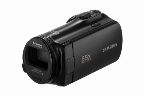
The camera we used was a Canon Full HD Camcorder, the camera had a large amount of built in memory which meant we didn't need to worry about how long the clips went on for or how many clips we ended up filming because we had plenty of space on the camera to experiment and re-do the shots which we didn't like or weren't 100% sure about. The camera also has auto-focus, which was extremely helpful for us because we were filming in an environment where there was a lot going on in shot so having auto-focus meant we could focus more on what there people in the clip were doing and less on minor things like whether the camera was in focus or not.

After trailing the programmes we were going to use for our Digipak and Magazine advert we decided that our best option was Photoshop, it allowed us to add a broad amount of effects and fonts onto our Digipak. I liked using Photoshop as it was easy to pick up and also allowed us to give our Digipak and Magazine advert a very professional finish, meaning it looked like it had been created by an actual institution.

Evaluation
Through-out the entire process of making our project I have used Blogger to document my progress and create a timeline on my blog similar to that of a Diary, showing the journey we have made from our initial ideas and choosing the song we wanted to use to having a final video, Digipack and Magazine advert. Blogger is a really easy site to use which allows you to not only create individual post which can contain slideshows, images and videos, but it also allows you to organise everything in a way which is easy to look back on and use in each stage of our project. The evaluation stage has been made a lot easier by blogger because I knew I wanted to do every question in a different way, using different forms of technology, and using blogger allows me to use any type of technology I want, because I can just embed it onto my blog and it will appear there.

Saturday, 1 March 2014

Friday, 21 February 2014

Evaluation Question 2

How effective is the combination of the main product (your music videos) and ancillary tasks (digipack and magazine advert)?


Thursday, 13 February 2014

Evaluation Question 1

In what way does your media product use, develop or challenge forms and conventions of real media products?


Monday, 16 December 2013

Top Music Videos Research

As it is nearing the end of the year, many websites and blogs are releasing posts and articles highlighting which music videos have been the most popular this year. I have decided to take information from one of the posts and analysis some of the decision to see why they were most popular, what aspects of the video made them popular and also if what parts of the video I like and dislike. I have decided to use Rolling Stone's 'Top 10 Music Videos of 2013' as they are a reputable music source.

Number 10 - Vampire Weekend - "Diane Young"


Vampire Weekend are an indie band, who have a quite large and dedicated following of fans, this song was the first single off of their most recent album so it was bound to be quite successful. Vampire Weekend are one of my favourite bands and I personally think this video is one of their best, because it finds a good balance between narrative, which is mild as they are an indie band, but I find they work the beat and feel of the song in well with the video. As the song builds so does the video and that's why I think it is such a well liked video as the building of the song and video help build the viewing experience and help give the audience a better feel for the music. Rolling Stone quoted the video as 'frantic and hilarious' which I agree completely with, they achieved this by also using well known figures in the Indie scene such as 'Sky Ferreira, Santigold and David Longstreth', while also using a set which some will recognise from the famous Leonardo Da Vinci Painting of the final supper. This use of a well known painting will draw people from other musical scenes who probably wouldn't have watched the video otherwise, therefore widening the audience and gaining publicity.


Number 8 -  Macklemore & Ryan Lewis - "Can't Hold Us"

Macklemore and Ryan Lewis released this song as a second single off of their most recent album, as their first song was such a big hit both musically and due to the video going viral, this song and video were much anticipated, however also due to the fact that Macklemore and Ryan Lewis had exploded onto the music scene this year bringing in a whole new type of artist, Macklemore combines rapping and positive political messages, in a way which is accessible for many types of audiences, while using Ryan Lewis and various of artists to create and feature in his music. The video for this song covers more than just the song featuring a small narrative section at the beginning and end, also credits are featured making the video more of a short film than a video. I agree with the video being in the Top 10 because it suits the artists style of music but also challenges standard conventions of that genre, most rap artists wouldn't have a video with a narrative, or a video that is filmed in such a professional, almost sophisticated way, however this video does this successfully in my opinion.


Number 5 - Robin Thicke - "Blurred Lines"

Robin Thicke has exploded on to the scene this year with his controversial one hit wonder that is Blurred Lines. Undoubtedly the most controversial video of the year, the song combines singing and rap to form an all round standard misogynistic song that is expected in the Hip Hop/R&B world of today. The video in my opinion is very distasteful and painful to watch because of the blatant stereotypes of the genre which are featured, however I personally think the acknowledgment of these issues is 50/50 with the audience as the video and song are popular for two main reasons. The first being people actually like the song and video, enjoying the voyeuristic treatment of women and using it for their own viewing pleasure. The second reason I think its gotten so much attention is because people are fighting against the message and trying to make a point about it. However there is no arguing that the video has been a big hit this year, regardless of why, the video fits in with the Genre of the song and this is probably why people enjoy the video so much, as it is nothing out of the ordinary for what is expected of that genre.
 

Number 1 - Miley Cyrus - "Wrecking Ball" 

Miley Cyrus in the past year has probably made the biggest change to her musical identity and look than ever before in her life, some argue the changes to be bad, some argue good, but regardless Wrecking Ball was a complete game changer for Miley. After a year of criticism and at times abuse for her song 'We Can't Stop', she completely opens up to her audience and the world with her minimalistic video and ballad like song Wrecking Ball. Managing to claw back any respect people ever had for her, she ALMOST makes a tasteful video, the two element which I personally think make this such a popular video is the stripped back, honest feelings which are displayed in the video make it appealing for the audience who are hungry for anything to do with the artists personal life. However the video is also popular as people are intrigued to see and criticise her controversial chose to ride a wrecking ball naked.

Tuesday, 12 November 2013

Magazine Advert Plan 2

 
I have made a second magazine advert plan to aid our group in making our one, this time I have decided to focus less on the artist being the background and focus more on the use of colour. I have done this by taking a picture of Ben that has him holding a bright blue gun and using that colour to help make the title of his name stand out more. I have also used a similar image to the one I used in my Digipak plan to create some continuity. After looking at other magazine adverts for artists and album, I have tried to make this design more professional by adding things like a website and copyright at the bottom.

Magazine Advert Plan 1

This is a design I have created to give me and my group some ideas on what we want our Magazine Advert to look like, I have taken inspiration from other artists I have looked at as many of them have chosen to use bold text and contrasting colours. I have made the whole background of the advert a picture of out artist and then surrounded the picture with information like his name and the name of the album, and also the release date.

Analysis Of Magzaine Advert By Artist In Chosen Genre

Lana Del Rey - Born To Die

 
Font - In this magazine advert, the Fonts which the artist has chosen to use correspond very well with what the words are telling the audience. The larger words are in a much clearer bold font, these words are important things like what the name of the album is, and what the name of the artist is, these are like this as the audience need to be able to see who the artist is and what they are selling before anything else. The other information, like the release date is shown in the script font near the bottom of the page, this information is what people look for after they have found out who the album is buy, that is why it is nearer the bottom in a smaller font.
 
Colour - Overall, the colours used in this advert are very light, this will attract people if for example it is in a magazine like Kerrang! which usually has very dark colour in it. It also helps draw more attention to the picture of the artist as her hair and eyes are much darker than everything else in the picture. The colour of the font works well as it sticks with the theme of light colours in the advert, but the use of white goes well with the sky background, meaning the name of the artist still sticks out. There is also a theme created with the font of blue and white because the artists white shirt is used as a background for the album name.
 
 Images - There is only one image featured in this advert and it is a large one of the artist, this helps draw the audiences attention to the advert, also because Lana Del Rey has a very unique look people will be able to recognise her when looking at this advert. The image takes centre stage in the advert as it is edited to be in front of the title, almost making it seem like she is leaning out of the advert, making the audience feel closer to her and the advert.
 
I like Lana Del Rey's magazine advert as it draws the audience in, while also being very simple, I will definitely consider features she has used when it comes round to making our magazine advert such as, the prominent use of the picture of the artist and the colour themes.

Thursday, 7 November 2013

Digipak Plan 2

 
I have done a second plan for a digipak which will give me and my group ideas when we come to making our actual digipak, I created this one in Photoshop so it looks more professional than the last one I made, I have focused more on the pictures featured on the outside as they now fit with the themes that the album and the song have about the night. I have also thought more about the positioning and how easy it is to read the track names. I have also picked a better font for the artist name and the album title as they are much easier to read than my last design.

Tuesday, 5 November 2013

Digipak Plan 1

 
This is a design I have created to give me and my group some ideas on what we want our Digipak to look like, I have taken inspiration from other artists I have looked at as many of them have chosen to use Black and White or Grayscale colour themes. I have placed a picture of out artist on the front, his name and title of the album and then on the two folding side panels of the pack put the names of the 6 tracks that would be on the album. 

Analysis Of Digipak By Artist In Chosen Genre

The XX - Self Titled


Font -  The only font visible on the outside of this Digipak is the one which is used for the 'X' which is seen on two panels on the outside, this is a very plain font and is very effective in drawing attention to the pack. If I saw this Digipak on a self in a shop I would be immediately drawn to it because it is eye catching due to its simplicity, some bands wouldn't make a Digipak this simple, but I personally think it is very effective and enticing, I would considering a simple design for my groups Digipak, similar to this.
 
Colour - This Digipak is completely Black and White, which also adds to the simplicity of the pack, put also aids in catching the eye of the potential audience. The combination of any other two colours wouldn't have been as effective as the use of the two colours shown here and Black and White are complete opposites.
 
Packaging - There are 2 CD holders in this Digipak, both of which are seen to be made of plastic and are the design which is used for most Digipak insides. The 'X's which are seen on the outside of the packing haven't been simply printed on, they are actually created by using two layers of different coloured card, on of which has an 'X' cut out of it, they are then layered over each other to create a much more stylish and crisp Digipak.
 
I would certainly consider some of the featured and themes which have been used in this Digipak created by 'The XX' as they create music similar to Ben, our chosen artist, and because they have managed to create a very simple Digipak, but also make it look very stylish. However when creating out Digipak we are considering featuring more words on the back in the form of a track list and also some pictures of possible the artist on the front panels.

Pitch Idea Based On Lyrics

Lights - Ben Pavitt

Running fast, fast for a life
Taking our moments and living right
Cos we saw freedom it had no pride
Tonight we’re gonna survive
So turn on the lights yeah we’re ready tonight yeah we’re not scared to fight
Cos we’ve got one life yeah we’re ready to party and we’re feeling alive
Try and stop us make it happen cos we’re running wild
The city is dreaming our body is screaming only one chance tonight
Only, one chance, tonight
Yeah they turn to me and say
The sky’s a limit and we’re not dead
So let’s go crazy tonight is day
Cos baby tonight were gonna live this away
So turn on the lights yeah we’re ready tonight yeah we’re not scared to fight
Cos we’ve got one life yeah we’re ready to party and we’re feeling alive
Try and stop us make it happen cos we’re running wild
The city is dreaming our body is screaming only one chance tonight (x2)
Stars in our eyes
Under, this ordinary moonlight
Our skeleton shaking
This life were making
This world is mine
This world is mine
 
So turn on the lights yeah we’re ready tonight yeah we’re not scared to fight
Cos we’ve got one life yeah we’re ready to party and we’re feeling alive
Try and stop us make it happen cos we’re running wild
The city is dreaming our body is screaming only one chance tonight (x3)
 
So, are you alive?

Pitch Idea

The lyrics to the song we have chosen to make a music video for a shown above. The basic plot of this song is being sung from the point of view Ben, the artist we have chosen to make a music video for, he is singing about growing up and being a teenage who is going through a phase in his life where he is finding himself along with all of his friends. This has made us want to base our video at a party as it will link well with the lyrics and we will be able to display many sections of the lyrics with the visuals in our video. We have also decided to film our video at night a he mentions the time of day being 'tonight' multiple times. Due to the song be very slow and instrumental throughout we are considering putting any shot that contains Ben in black and white, and also making some shots of people at the party in slow motion so it fits with the tempo and rhythm of the song. We also want the themes of the video to juxtapose each other at many points, we are going to make Ben an emotionally struggling character in the video, while everyone else in the video is in normal or happy moods, showing how he is struggling with his emotions and this part in his life.

Lyric Analysis and Their Importance

Lyrics of a song are very important with regards to a music video because most of the time, when a music video is made, it contains a narrative which is the root and main theme in the video. The lyrics of a video are usually the inspiration for what happens in the video and most of the time references to the lyrics are made throughout.
 
If we look at Goodwin's Theory of Music Videos, we can see that many of his points include the crossing over and inclusion of lyrics and visuals or the lyrics and the narrative. In some cases the lyrics of the video may be references through the use of characters moving, dancing or acting, however sometimes they may be referenced by having the actual object mentioned in the lyrics present in the video, or by having the lyrics come up on screen using a font.
 
The main importance that lyrics have with regards to a music video is the fact that without lyrics, lip syncing wouldn't be possible, and lip syncing is the most recognised and used feature of a music video, it is extremely rare and risky for an artist to not put lip syncing in their video.
'A little gambling is fun when you're with me' - is sung when the artist is holding up playing cards and playing poker.
 
'Baby, you're a firework' - is sung while the artist has fireworks shooting out of her chest.

 
 This analysis will help me when it comes to planning and making my music video as it has shown me how the lyrics of a song can influence the narrative and images seen in the final music video. This analysis has given me new ideas for what I potentially want to feature in my final video, allowing me to be more creative in the planning stage of my video.

Magazine Advert Analysis - Mumford and Sons

Mumford and Sons - Sigh No More


 Font - This magazine advert contains the same font throughout the advert, which creates a sense of continuity and style throughout, the font is a very classic font however it also fits in with the rustic and classic theme that the band upholds. The largest piece of writing on the advert is a name of the band, which will aid in initially grabbing and drawing in the audiences attention. The second largest is the title of the album which is also important when involving the audience and gaining their attention. The remaining words are a quote from another magazine which helps sell the bend and the album, and songs which are featured on the album.
 
Colour - This advert uses colour in a similar way to most bands. It uses a dark coloured background with light coloured writing to create a contrast of colour which stands out and draws attention to the poster. There are also 4 pictures which show each member of the band, the colour and contrast of these pictures is similar to the rest of the poster making it look very professional and stylish once again.
 
Images - There is only 4 images shown in this advert, they are all similar and show the band members. The images shown are very vintage looking but because they are central to the poster, there is a large amount of attention on them, also each band member is shown holding or playing the instrument which they would play when in the band, this also helps to inform the audience of what the band do and will maybe help create more interest in the band. The images in the advert as square and have markings in the corner, this suggests that they are polaroid pictures which they gone out and taken themselves, this gives the audience the idea that they are very edgy and rustic as instead of having a professional photo shoot in a studio they have decided to go out and take the pictures themselves of out in the environment, this also makes suggestions to the audience about what their music is like. 

Magzine Advert Analysis - Florence and the Machine

Florence and the Machine - Lungs


 Font - This magazine advert brings to the audience attention two initial parts of the advert with regards to the font, first is the name of the artist, which is seen at the very top of the page, this is where most people will look first when looking at an advert, so they can initially build up an idea of what the product will be like before they purchase it by knowing who it is created by. You are then shown the title of the new album, which will add to what the audience expectation of the album will be. There is also a release date, which is obviously an important part of an advert as it informs the audience as to when the product is available.
 
Colour - This advert uses colour to it advantage, everything on the advert is black and white except the picture of the artist, which also draws the attention of the audience as they may recognise who is in the picture, also adding to their expectation of the album. The font is made to stand out a lot more by the use of black and white, as they are colours which best go together. The overall usage of colour in this magazine advert is very natural and calm, this could suggest to readers that the artist is like this as well, suggesting they are very genuine and produce natural music, as opposed to an artist who uses bright colours in their adverts, suggesting they create over the top music.
 
Images - There is only one image used in this advert as it is of the artist. This helps a lot when making an effective advert, especially when it is for a well established artist as people are likely to see the advert and recognise the artist. The advert shows the artist looks to the right with her eyes closed, creating an air of mystery, also the picture is linked to the title of the album as the artist can be seen with iron like lungs on her chest. The pictures and the font in the advert are all well proportioned meaning that the attention to each component in this advert is relatively equal.
 
 This analysis has given me an in-depth look into how Magazine Adverts are constructed and the different parts which make them up. Doing this analysis will help me when it comes to planning and making mine as I now have a greater knowledge of Magazine Adverts, how they use their components to grab the readers attention but also how they are constructed.  


Digipak Analysis - Katy Perry

Katy Perry - Teenage Dream


 Font -  The font which is used for the track listing on the back of the Digipak is different to the font which is used on the information pack on the inside of the Digipak, however the most interesting thing about the font and writing used on this Digipak is the fact that there isn't any writing on the front of it, this is done because the picture of the artist Katy Perry, is very striking and some would argue it doesn't need a title as it is recognisable and draws enough attention without the use of a title. Also the colouring of the font on the outside of the Digipak is red which means it stands out against the light blue and pink which is pictured on the outside.
 
Colour - This Digipak is very colourful, which link in to the theme of the artists current album cycle, the outside of the album has the running theme of what seems to be cloud of candy floss, these gives the album a girly theme. There are also two pictures of the artist shown on the outside of the album, which have a lot more contrast than the background image, meaning they stand out more. The disks which are seen on the inside are also very colourful and continue the theme that the artist is using of sweets.
 
Key Images - There are many key images and also themes running throughout not only this Digipack by Katy Perry, but also her entire album cycle. She has the on going theme of sweets and feminine colours, this continuity with the theme will stick in peoples minds and enable them to recognise her work in other sections of the media. For example, the exact framing of her album cover is featured in her video for 'California Gurls'. Also the on going theme of sweets is seen on the outside of the album with the background picture being of Candy Floss and also on the inside of the album as her CD's look like sweets as well.  
 
Packaging - There are 2 CD's in this Digipak, both of which contain the same theme, the only difference is the pictures on them. Both the CD's slide into the case, rather than being held in with plastic, this saves the record label money when. The packaging contains two pictures of the artist on the outside with the continuous candy floss theme, there is also an information pack on the inside which shows another picture of the artist, also continuing the theme of sweets. 
 
This analysis has given me an in-depth look into how digipack's are constructed and the different parts which make them up. Doing this analysis will help me when it comes to planning and making mine as I now have a greater knowledge of digipack's and how they are constructed.  

Friday, 25 October 2013

Digipak Analysis - Lady Gaga

Lady Gaga - The Fame Monster

 
Font -  The font used inside this Digipak by the artist Lady Gaga if the same throughout, this gives the casing consistency and makes it look more professional, also the font which is used is the font which is present on everything to do with advertising and selling this artists new album, this point will help when trying to get people to buy the alum as they may have seen the font before and recognise it.
 
Colour - This Digipak is completely black and white, some people would be hesitant to do this especially an artist who is so famous, however the contrast between the black and white makes the album stand out a lot more, even the pictures are black and white, like the use of the consistent font, the black and white throughout the casing makes the album look more professional.
 
Packaging - There are 2 CD's in this Digipak, both of which are almost identical, the only difference is the numbers on the CD's, they are both held in place in transparent plastic casing, which means you can see through to the design underneath. The remaining inside panel and one outside panel has pictures of the artist on them, then the two remaining front ones have the album cover and the track list on the back.
 
This analysis has given me an in-depth look into how digipack's are constructed and the different parts which make them up. Doing this analysis will help me when it comes to planning and making mine as I now have a greater knowledge of digipack's and how they are constructed.  
 

Thursday, 24 October 2013

What is a Digipack and Magazine Advertisment?

What is a Digipack?

A Digipack is a style of CD, DVD or Disk packaging, which is usually made up of 6-8 panels that contain pictures and plastic trays, which are able to hold the disks. Digipack packaging tends to be used for special edition CD’s or DVD’s as it is more expensive than using a normal Jewel Case for holding the CD, plus it looks more modern than the Jewel Case, however because there is usually no laminate over the designs on the case, it is less resistant to abrasion, meaning it shows wear and fading more.
An example of a 6 panel Digipack
 Digipack's are also an effective way of the company who are distributing it for the artist making more money. For big fans of an artist, they will want to get their hands on as much merchandise and memorabilia as they can, by making a Digipack as well as a normal type of CD casing, they will make more money by selling the Digipack as a 'special edition'. Doing this will not only help them make more money, but it will also help the chart position of the artist or album as some people will be purchasing two copies of the album in the form of a normal CD and a Digipack.


What is a magazine advertisement?

A magazine advertisement is usually a whole page or a small section on a page that is a trying to attract a certain demographic of people to purchase the product. Usually the type of product that is being advertised is taken into consideration when choosing which magazine it is being placed in as certain types of people buy certain types of magazines, for example an advert for a new children’s film wouldn’t be seen in a men’s magazine, however an advert for a new album would be seen in NME magazine as it would appeal to the type of people buying the magazine.
An example of a Magazine advert in NME magazine.
Both Digipack’s and Magazine advert are important, Digipack’s are important as they give the buyer an idea of what the bands style and design is like, if a band has a badly designed or made Digipack the buyer will think the band are unprofessional and this may make the buyer think less of the band. Also having an eye catching and well-designed magazine advert will attract more potential buyers and fans for the band that will increase the bands album sales and popularity.

Tuesday, 22 October 2013

Cultural Effects Model & How It Applies To Music Video

The Cultural Effects Model states that if the same media messages are repeated often enough they will be accepted as fact but audience members can resist these messages. It also suggests that the audience are active and can 'decode' messages in media texts in a number of ways.

There can be different types of readings in The Cultural Effects Model : Dominant, negotiated and oppositional.
Dominant is when the viewer will view the music video and completely understand and absorb the message that the institution has placed in the video.
Negotiated is when the viewer watches the music video and understands the message of the video that the institution has places but might not agree with the message.
Oppositional is when the viewer watched the music video but decides not to view or absorb the message that the institution has put in the video.
We need to make our music video memorable all the while making it so that no one forgets the name of the song and the artist.

When we come to make our music video we will use The Cultural Effects Model to help us make the message of our music video good, we are going to make the message of our music video about how people can feel alone even when they are surrounded by lots of people who are having a good time, in our case at a party.

We Can't Stop - Miley Cyrus

Above is the music video for We Can't Stop by Miley Cyrus, in this video Miley is seen to be partying and dressed in very little clothing. Due to the fact Miley Cyrus is a child star with a large following of primarily under 18s, this video is seen to be very controversial as she is doing things and behaving in a way which would be seen to be inappropriate for an under 18. The audience watching this video, no matter how young will see the video and immediately think that what Miley is doing is unacceptable because she is seen to be a role model by most of her fans.
 
People who have a Dominant view of this video will look at the video and understand that the video is about her and all of her friends having a party and probably won't be able to see any issue with the video.
People who have a Negotiated view of the video will watch the video and be able to see the intended message which has been put in place by the institution but they will also be able to see how other people could find issues and things that are inappropriate with the video.
People who have an Oppositional view of this video will watch it and most likely miss-read the intended message of the institutions and see negative things with the video.   

When making our video, because we are doing along the route of throwing a party, we don't want our video to come out like this one, Miley's video could be seen as tacky, and focusing more on the behaviour in the video as opposed to the actual music and the song.