Monday 16 December 2013

Top Music Videos Research

As it is nearing the end of the year, many websites and blogs are releasing posts and articles highlighting which music videos have been the most popular this year. I have decided to take information from one of the posts and analysis some of the decision to see why they were most popular, what aspects of the video made them popular and also if what parts of the video I like and dislike. I have decided to use Rolling Stone's 'Top 10 Music Videos of 2013' as they are a reputable music source.

Number 10 - Vampire Weekend - "Diane Young"


Vampire Weekend are an indie band, who have a quite large and dedicated following of fans, this song was the first single off of their most recent album so it was bound to be quite successful. Vampire Weekend are one of my favourite bands and I personally think this video is one of their best, because it finds a good balance between narrative, which is mild as they are an indie band, but I find they work the beat and feel of the song in well with the video. As the song builds so does the video and that's why I think it is such a well liked video as the building of the song and video help build the viewing experience and help give the audience a better feel for the music. Rolling Stone quoted the video as 'frantic and hilarious' which I agree completely with, they achieved this by also using well known figures in the Indie scene such as 'Sky Ferreira, Santigold and David Longstreth', while also using a set which some will recognise from the famous Leonardo Da Vinci Painting of the final supper. This use of a well known painting will draw people from other musical scenes who probably wouldn't have watched the video otherwise, therefore widening the audience and gaining publicity.


Number 8 -  Macklemore & Ryan Lewis - "Can't Hold Us"

Macklemore and Ryan Lewis released this song as a second single off of their most recent album, as their first song was such a big hit both musically and due to the video going viral, this song and video were much anticipated, however also due to the fact that Macklemore and Ryan Lewis had exploded onto the music scene this year bringing in a whole new type of artist, Macklemore combines rapping and positive political messages, in a way which is accessible for many types of audiences, while using Ryan Lewis and various of artists to create and feature in his music. The video for this song covers more than just the song featuring a small narrative section at the beginning and end, also credits are featured making the video more of a short film than a video. I agree with the video being in the Top 10 because it suits the artists style of music but also challenges standard conventions of that genre, most rap artists wouldn't have a video with a narrative, or a video that is filmed in such a professional, almost sophisticated way, however this video does this successfully in my opinion.


Number 5 - Robin Thicke - "Blurred Lines"

Robin Thicke has exploded on to the scene this year with his controversial one hit wonder that is Blurred Lines. Undoubtedly the most controversial video of the year, the song combines singing and rap to form an all round standard misogynistic song that is expected in the Hip Hop/R&B world of today. The video in my opinion is very distasteful and painful to watch because of the blatant stereotypes of the genre which are featured, however I personally think the acknowledgment of these issues is 50/50 with the audience as the video and song are popular for two main reasons. The first being people actually like the song and video, enjoying the voyeuristic treatment of women and using it for their own viewing pleasure. The second reason I think its gotten so much attention is because people are fighting against the message and trying to make a point about it. However there is no arguing that the video has been a big hit this year, regardless of why, the video fits in with the Genre of the song and this is probably why people enjoy the video so much, as it is nothing out of the ordinary for what is expected of that genre.
 

Number 1 - Miley Cyrus - "Wrecking Ball" 

Miley Cyrus in the past year has probably made the biggest change to her musical identity and look than ever before in her life, some argue the changes to be bad, some argue good, but regardless Wrecking Ball was a complete game changer for Miley. After a year of criticism and at times abuse for her song 'We Can't Stop', she completely opens up to her audience and the world with her minimalistic video and ballad like song Wrecking Ball. Managing to claw back any respect people ever had for her, she ALMOST makes a tasteful video, the two element which I personally think make this such a popular video is the stripped back, honest feelings which are displayed in the video make it appealing for the audience who are hungry for anything to do with the artists personal life. However the video is also popular as people are intrigued to see and criticise her controversial chose to ride a wrecking ball naked.

Tuesday 12 November 2013

Magazine Advert Plan 2

 
I have made a second magazine advert plan to aid our group in making our one, this time I have decided to focus less on the artist being the background and focus more on the use of colour. I have done this by taking a picture of Ben that has him holding a bright blue gun and using that colour to help make the title of his name stand out more. I have also used a similar image to the one I used in my Digipak plan to create some continuity. After looking at other magazine adverts for artists and album, I have tried to make this design more professional by adding things like a website and copyright at the bottom.

Magazine Advert Plan 1

This is a design I have created to give me and my group some ideas on what we want our Magazine Advert to look like, I have taken inspiration from other artists I have looked at as many of them have chosen to use bold text and contrasting colours. I have made the whole background of the advert a picture of out artist and then surrounded the picture with information like his name and the name of the album, and also the release date.

Analysis Of Magzaine Advert By Artist In Chosen Genre

Lana Del Rey - Born To Die

 
Font - In this magazine advert, the Fonts which the artist has chosen to use correspond very well with what the words are telling the audience. The larger words are in a much clearer bold font, these words are important things like what the name of the album is, and what the name of the artist is, these are like this as the audience need to be able to see who the artist is and what they are selling before anything else. The other information, like the release date is shown in the script font near the bottom of the page, this information is what people look for after they have found out who the album is buy, that is why it is nearer the bottom in a smaller font.
 
Colour - Overall, the colours used in this advert are very light, this will attract people if for example it is in a magazine like Kerrang! which usually has very dark colour in it. It also helps draw more attention to the picture of the artist as her hair and eyes are much darker than everything else in the picture. The colour of the font works well as it sticks with the theme of light colours in the advert, but the use of white goes well with the sky background, meaning the name of the artist still sticks out. There is also a theme created with the font of blue and white because the artists white shirt is used as a background for the album name.
 
 Images - There is only one image featured in this advert and it is a large one of the artist, this helps draw the audiences attention to the advert, also because Lana Del Rey has a very unique look people will be able to recognise her when looking at this advert. The image takes centre stage in the advert as it is edited to be in front of the title, almost making it seem like she is leaning out of the advert, making the audience feel closer to her and the advert.
 
I like Lana Del Rey's magazine advert as it draws the audience in, while also being very simple, I will definitely consider features she has used when it comes round to making our magazine advert such as, the prominent use of the picture of the artist and the colour themes.

Thursday 7 November 2013

Digipak Plan 2

 
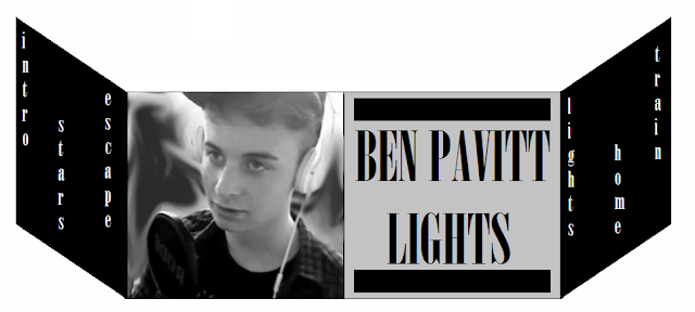
I have done a second plan for a digipak which will give me and my group ideas when we come to making our actual digipak, I created this one in Photoshop so it looks more professional than the last one I made, I have focused more on the pictures featured on the outside as they now fit with the themes that the album and the song have about the night. I have also thought more about the positioning and how easy it is to read the track names. I have also picked a better font for the artist name and the album title as they are much easier to read than my last design.

Tuesday 5 November 2013

Digipak Plan 1

 
This is a design I have created to give me and my group some ideas on what we want our Digipak to look like, I have taken inspiration from other artists I have looked at as many of them have chosen to use Black and White or Grayscale colour themes. I have placed a picture of out artist on the front, his name and title of the album and then on the two folding side panels of the pack put the names of the 6 tracks that would be on the album. 

Analysis Of Digipak By Artist In Chosen Genre

The XX - Self Titled


Font -  The only font visible on the outside of this Digipak is the one which is used for the 'X' which is seen on two panels on the outside, this is a very plain font and is very effective in drawing attention to the pack. If I saw this Digipak on a self in a shop I would be immediately drawn to it because it is eye catching due to its simplicity, some bands wouldn't make a Digipak this simple, but I personally think it is very effective and enticing, I would considering a simple design for my groups Digipak, similar to this.
 
Colour - This Digipak is completely Black and White, which also adds to the simplicity of the pack, put also aids in catching the eye of the potential audience. The combination of any other two colours wouldn't have been as effective as the use of the two colours shown here and Black and White are complete opposites.
 
Packaging - There are 2 CD holders in this Digipak, both of which are seen to be made of plastic and are the design which is used for most Digipak insides. The 'X's which are seen on the outside of the packing haven't been simply printed on, they are actually created by using two layers of different coloured card, on of which has an 'X' cut out of it, they are then layered over each other to create a much more stylish and crisp Digipak.
 
I would certainly consider some of the featured and themes which have been used in this Digipak created by 'The XX' as they create music similar to Ben, our chosen artist, and because they have managed to create a very simple Digipak, but also make it look very stylish. However when creating out Digipak we are considering featuring more words on the back in the form of a track list and also some pictures of possible the artist on the front panels.

Pitch Idea Based On Lyrics

Lights - Ben Pavitt

Running fast, fast for a life
Taking our moments and living right
Cos we saw freedom it had no pride
Tonight we’re gonna survive
So turn on the lights yeah we’re ready tonight yeah we’re not scared to fight
Cos we’ve got one life yeah we’re ready to party and we’re feeling alive
Try and stop us make it happen cos we’re running wild
The city is dreaming our body is screaming only one chance tonight
Only, one chance, tonight
Yeah they turn to me and say
The sky’s a limit and we’re not dead
So let’s go crazy tonight is day
Cos baby tonight were gonna live this away
So turn on the lights yeah we’re ready tonight yeah we’re not scared to fight
Cos we’ve got one life yeah we’re ready to party and we’re feeling alive
Try and stop us make it happen cos we’re running wild
The city is dreaming our body is screaming only one chance tonight (x2)
Stars in our eyes
Under, this ordinary moonlight
Our skeleton shaking
This life were making
This world is mine
This world is mine
 
So turn on the lights yeah we’re ready tonight yeah we’re not scared to fight
Cos we’ve got one life yeah we’re ready to party and we’re feeling alive
Try and stop us make it happen cos we’re running wild
The city is dreaming our body is screaming only one chance tonight (x3)
 
So, are you alive?

Pitch Idea

The lyrics to the song we have chosen to make a music video for a shown above. The basic plot of this song is being sung from the point of view Ben, the artist we have chosen to make a music video for, he is singing about growing up and being a teenage who is going through a phase in his life where he is finding himself along with all of his friends. This has made us want to base our video at a party as it will link well with the lyrics and we will be able to display many sections of the lyrics with the visuals in our video. We have also decided to film our video at night a he mentions the time of day being 'tonight' multiple times. Due to the song be very slow and instrumental throughout we are considering putting any shot that contains Ben in black and white, and also making some shots of people at the party in slow motion so it fits with the tempo and rhythm of the song. We also want the themes of the video to juxtapose each other at many points, we are going to make Ben an emotionally struggling character in the video, while everyone else in the video is in normal or happy moods, showing how he is struggling with his emotions and this part in his life.

Lyric Analysis and Their Importance

Lyrics of a song are very important with regards to a music video because most of the time, when a music video is made, it contains a narrative which is the root and main theme in the video. The lyrics of a video are usually the inspiration for what happens in the video and most of the time references to the lyrics are made throughout.
 
If we look at Goodwin's Theory of Music Videos, we can see that many of his points include the crossing over and inclusion of lyrics and visuals or the lyrics and the narrative. In some cases the lyrics of the video may be references through the use of characters moving, dancing or acting, however sometimes they may be referenced by having the actual object mentioned in the lyrics present in the video, or by having the lyrics come up on screen using a font.
 
The main importance that lyrics have with regards to a music video is the fact that without lyrics, lip syncing wouldn't be possible, and lip syncing is the most recognised and used feature of a music video, it is extremely rare and risky for an artist to not put lip syncing in their video.
'A little gambling is fun when you're with me' - is sung when the artist is holding up playing cards and playing poker.
 
'Baby, you're a firework' - is sung while the artist has fireworks shooting out of her chest.

 
 This analysis will help me when it comes to planning and making my music video as it has shown me how the lyrics of a song can influence the narrative and images seen in the final music video. This analysis has given me new ideas for what I potentially want to feature in my final video, allowing me to be more creative in the planning stage of my video.

Magazine Advert Analysis - Mumford and Sons

Mumford and Sons - Sigh No More


 Font - This magazine advert contains the same font throughout the advert, which creates a sense of continuity and style throughout, the font is a very classic font however it also fits in with the rustic and classic theme that the band upholds. The largest piece of writing on the advert is a name of the band, which will aid in initially grabbing and drawing in the audiences attention. The second largest is the title of the album which is also important when involving the audience and gaining their attention. The remaining words are a quote from another magazine which helps sell the bend and the album, and songs which are featured on the album.
 
Colour - This advert uses colour in a similar way to most bands. It uses a dark coloured background with light coloured writing to create a contrast of colour which stands out and draws attention to the poster. There are also 4 pictures which show each member of the band, the colour and contrast of these pictures is similar to the rest of the poster making it look very professional and stylish once again.
 
Images - There is only 4 images shown in this advert, they are all similar and show the band members. The images shown are very vintage looking but because they are central to the poster, there is a large amount of attention on them, also each band member is shown holding or playing the instrument which they would play when in the band, this also helps to inform the audience of what the band do and will maybe help create more interest in the band. The images in the advert as square and have markings in the corner, this suggests that they are polaroid pictures which they gone out and taken themselves, this gives the audience the idea that they are very edgy and rustic as instead of having a professional photo shoot in a studio they have decided to go out and take the pictures themselves of out in the environment, this also makes suggestions to the audience about what their music is like. 

Magzine Advert Analysis - Florence and the Machine

Florence and the Machine - Lungs


 Font - This magazine advert brings to the audience attention two initial parts of the advert with regards to the font, first is the name of the artist, which is seen at the very top of the page, this is where most people will look first when looking at an advert, so they can initially build up an idea of what the product will be like before they purchase it by knowing who it is created by. You are then shown the title of the new album, which will add to what the audience expectation of the album will be. There is also a release date, which is obviously an important part of an advert as it informs the audience as to when the product is available.
 
Colour - This advert uses colour to it advantage, everything on the advert is black and white except the picture of the artist, which also draws the attention of the audience as they may recognise who is in the picture, also adding to their expectation of the album. The font is made to stand out a lot more by the use of black and white, as they are colours which best go together. The overall usage of colour in this magazine advert is very natural and calm, this could suggest to readers that the artist is like this as well, suggesting they are very genuine and produce natural music, as opposed to an artist who uses bright colours in their adverts, suggesting they create over the top music.
 
Images - There is only one image used in this advert as it is of the artist. This helps a lot when making an effective advert, especially when it is for a well established artist as people are likely to see the advert and recognise the artist. The advert shows the artist looks to the right with her eyes closed, creating an air of mystery, also the picture is linked to the title of the album as the artist can be seen with iron like lungs on her chest. The pictures and the font in the advert are all well proportioned meaning that the attention to each component in this advert is relatively equal.
 
 This analysis has given me an in-depth look into how Magazine Adverts are constructed and the different parts which make them up. Doing this analysis will help me when it comes to planning and making mine as I now have a greater knowledge of Magazine Adverts, how they use their components to grab the readers attention but also how they are constructed.  


Digipak Analysis - Katy Perry

Katy Perry - Teenage Dream


 Font -  The font which is used for the track listing on the back of the Digipak is different to the font which is used on the information pack on the inside of the Digipak, however the most interesting thing about the font and writing used on this Digipak is the fact that there isn't any writing on the front of it, this is done because the picture of the artist Katy Perry, is very striking and some would argue it doesn't need a title as it is recognisable and draws enough attention without the use of a title. Also the colouring of the font on the outside of the Digipak is red which means it stands out against the light blue and pink which is pictured on the outside.
 
Colour - This Digipak is very colourful, which link in to the theme of the artists current album cycle, the outside of the album has the running theme of what seems to be cloud of candy floss, these gives the album a girly theme. There are also two pictures of the artist shown on the outside of the album, which have a lot more contrast than the background image, meaning they stand out more. The disks which are seen on the inside are also very colourful and continue the theme that the artist is using of sweets.
 
Key Images - There are many key images and also themes running throughout not only this Digipack by Katy Perry, but also her entire album cycle. She has the on going theme of sweets and feminine colours, this continuity with the theme will stick in peoples minds and enable them to recognise her work in other sections of the media. For example, the exact framing of her album cover is featured in her video for 'California Gurls'. Also the on going theme of sweets is seen on the outside of the album with the background picture being of Candy Floss and also on the inside of the album as her CD's look like sweets as well.  
 
Packaging - There are 2 CD's in this Digipak, both of which contain the same theme, the only difference is the pictures on them. Both the CD's slide into the case, rather than being held in with plastic, this saves the record label money when. The packaging contains two pictures of the artist on the outside with the continuous candy floss theme, there is also an information pack on the inside which shows another picture of the artist, also continuing the theme of sweets. 
 
This analysis has given me an in-depth look into how digipack's are constructed and the different parts which make them up. Doing this analysis will help me when it comes to planning and making mine as I now have a greater knowledge of digipack's and how they are constructed.  

Friday 25 October 2013

Digipak Analysis - Lady Gaga

Lady Gaga - The Fame Monster

 
Font -  The font used inside this Digipak by the artist Lady Gaga if the same throughout, this gives the casing consistency and makes it look more professional, also the font which is used is the font which is present on everything to do with advertising and selling this artists new album, this point will help when trying to get people to buy the alum as they may have seen the font before and recognise it.
 
Colour - This Digipak is completely black and white, some people would be hesitant to do this especially an artist who is so famous, however the contrast between the black and white makes the album stand out a lot more, even the pictures are black and white, like the use of the consistent font, the black and white throughout the casing makes the album look more professional.
 
Packaging - There are 2 CD's in this Digipak, both of which are almost identical, the only difference is the numbers on the CD's, they are both held in place in transparent plastic casing, which means you can see through to the design underneath. The remaining inside panel and one outside panel has pictures of the artist on them, then the two remaining front ones have the album cover and the track list on the back.
 
This analysis has given me an in-depth look into how digipack's are constructed and the different parts which make them up. Doing this analysis will help me when it comes to planning and making mine as I now have a greater knowledge of digipack's and how they are constructed.  
 

Thursday 24 October 2013

What is a Digipack and Magazine Advertisment?

What is a Digipack?

A Digipack is a style of CD, DVD or Disk packaging, which is usually made up of 6-8 panels that contain pictures and plastic trays, which are able to hold the disks. Digipack packaging tends to be used for special edition CD’s or DVD’s as it is more expensive than using a normal Jewel Case for holding the CD, plus it looks more modern than the Jewel Case, however because there is usually no laminate over the designs on the case, it is less resistant to abrasion, meaning it shows wear and fading more.
An example of a 6 panel Digipack
 Digipack's are also an effective way of the company who are distributing it for the artist making more money. For big fans of an artist, they will want to get their hands on as much merchandise and memorabilia as they can, by making a Digipack as well as a normal type of CD casing, they will make more money by selling the Digipack as a 'special edition'. Doing this will not only help them make more money, but it will also help the chart position of the artist or album as some people will be purchasing two copies of the album in the form of a normal CD and a Digipack.


What is a magazine advertisement?

A magazine advertisement is usually a whole page or a small section on a page that is a trying to attract a certain demographic of people to purchase the product. Usually the type of product that is being advertised is taken into consideration when choosing which magazine it is being placed in as certain types of people buy certain types of magazines, for example an advert for a new children’s film wouldn’t be seen in a men’s magazine, however an advert for a new album would be seen in NME magazine as it would appeal to the type of people buying the magazine.
An example of a Magazine advert in NME magazine.
Both Digipack’s and Magazine advert are important, Digipack’s are important as they give the buyer an idea of what the bands style and design is like, if a band has a badly designed or made Digipack the buyer will think the band are unprofessional and this may make the buyer think less of the band. Also having an eye catching and well-designed magazine advert will attract more potential buyers and fans for the band that will increase the bands album sales and popularity.

Tuesday 22 October 2013

Cultural Effects Model & How It Applies To Music Video

The Cultural Effects Model states that if the same media messages are repeated often enough they will be accepted as fact but audience members can resist these messages. It also suggests that the audience are active and can 'decode' messages in media texts in a number of ways.

There can be different types of readings in The Cultural Effects Model : Dominant, negotiated and oppositional.
Dominant is when the viewer will view the music video and completely understand and absorb the message that the institution has placed in the video.
Negotiated is when the viewer watches the music video and understands the message of the video that the institution has places but might not agree with the message.
Oppositional is when the viewer watched the music video but decides not to view or absorb the message that the institution has put in the video.
We need to make our music video memorable all the while making it so that no one forgets the name of the song and the artist.

When we come to make our music video we will use The Cultural Effects Model to help us make the message of our music video good, we are going to make the message of our music video about how people can feel alone even when they are surrounded by lots of people who are having a good time, in our case at a party.

We Can't Stop - Miley Cyrus

Above is the music video for We Can't Stop by Miley Cyrus, in this video Miley is seen to be partying and dressed in very little clothing. Due to the fact Miley Cyrus is a child star with a large following of primarily under 18s, this video is seen to be very controversial as she is doing things and behaving in a way which would be seen to be inappropriate for an under 18. The audience watching this video, no matter how young will see the video and immediately think that what Miley is doing is unacceptable because she is seen to be a role model by most of her fans.
 
People who have a Dominant view of this video will look at the video and understand that the video is about her and all of her friends having a party and probably won't be able to see any issue with the video.
People who have a Negotiated view of the video will watch the video and be able to see the intended message which has been put in place by the institution but they will also be able to see how other people could find issues and things that are inappropriate with the video.
People who have an Oppositional view of this video will watch it and most likely miss-read the intended message of the institutions and see negative things with the video.   

When making our video, because we are doing along the route of throwing a party, we don't want our video to come out like this one, Miley's video could be seen as tacky, and focusing more on the behaviour in the video as opposed to the actual music and the song.


Lip Syncing & Its Importance

What is it?

Lip syncing is moving the lips in synchronisation with a recorded speech or song to give the illusion of a live performance. It is usually put in in the post production phase of a music video by combining the recorded piece of footage with the pre-recorded track. It is done by playing the song on set and have the artist or appropriate band member mime along to the section of words.

What is its importance?

Lip syncing is important in Music Videos as it is the main link between the video and the song, it very unusual that a video doesn't have any lip syncing in it as it is seen to be the main convention of a music video. Lip Syncing helps the audience understand what band member plays what role in the song and who the lead sing or singers are, it also makes the audience feel more included as they are essentially being sung at by the artist in the video. Also another main convention of music videos is performance, which usually can't be achieved without the use of lip syncing.
 The video above accompanies Lily Allen's song called 'Air Balloon', the video featured a great deal of lip syncing. It is obvious that she isn't singing live as she is in the middle of a field and isn't singing into a microphone, however on the set of the video the song would be playing out loud and she would be moving her lips along to the song to give the illusion that she is singing live.

Indepth Analysis of Video From Chosen Genre - Lana Del Rey

Young and Beautiful - Lana Del Rey

I have chosen to analysis this song as Lana Del Rey is an alternative artist, like the artist I have chosen to make a video for, and also because the video is similar to what we want to make and something we take inspiration from.
 
In terms of Goodwins Theory's on music videos, Young and Beautiful presents a lot of characteristics and really displays Goodwins Theory well.
 
Firstly, this video displays stereotypical genre characteristics of both the genre but also the artist, Del Rey is an alternative artist, and videos for this genre of music tend to be very mysterious and often very emotional and full of feeling as this is typically what music in this genre sounds like. The fact Del Rey has two tear drops on her face shows the emotion in the song, and also the use of an orchestra is not typical in any music video, this is done because Del Rey's video is alternative.
 
Secondly Del Rey is presenting a vague link between the lyrics and the visuals of her video, this is present when there is a shot of Del Rey in a long black dress with curly hair, some people viewing the video could say that she looks older than her age and is dressed slightly old fashioned, this shot has links to the lyrics 'When I'm no longer young and beautiful'. Links to this lyrics are also present when there are close ups of Del Rey as she looks youthful and young.
 
Like the link between lyrics and visuals there is a vague link between the visuals and the music, this can be seen when the orchestra are in shot. As the music lifts and build, so does the conductors body language and the rest of the people with instruments, although this is obviously going to happen as they are playing the music, it still aids in building the song and giving the audience more enjoyment by linking the music and visuals.
 
One of Goodwin's Theory points with regards to music videos is having multiple close ups of the artist in their video, this is very obvious and achieved in this video as for a long period of time at the start and also throughout the video, close up's of Del Rey lip syncing can be seen, this adds a performance aspect to the video which audiences and record labels alike also require or expect.
 
In this video there is no obvious attraction to the notion of how people look or dress, or any voyeuristic attitudes towards women. Due to the fact Del Rey is the only obvious female in the video, she gets the audience full attention, this is already going against what most music videos do where men are the central attraction. To even further the turn away from how women are typically represented in music videos, Del Rey is full clothed, not dancing or doing anything provocative, this will gain some of the audiences attention as this is something they might not expect to see when watching a female singer.
 
The song is featured in the film The Great Gatsby, although there are no clips of the film featured in this video, there are still underlying themes of the film present. Because the film is based in the 1920's the whole theme of the video and the people in it are dressed to suit a 1920's theme.
 
Class is represented slightly in the video as it is quite obvious the Del Rey is of an upper class as she is presented to the audience as someone with wealth and power by the fact she is wearing a large amount of diamond and nice dresses but also because she has an orchestra performing behind her and is centre stage despite being a female.

Indepth Analysis of Video From Chosen Genre - The XX

The XX - VCR


I have chosen to analysis this song as The XX are an alternative band, and this video for their song 'VCR' has similar themes to what we want to put into our video and also has some similar shots to what we want to put in our video as well. This music video also contains some theories which can be found in Goodwin's Theory of Music Videos.
 
Firstly, this video displays stereotypical genre characteristics of both the genre but also the artist, The XX are an alternative band, and their music and videos completely live up to and adhere to what is expected from this genre. Their music tends to be very mysterious and have a lot of hidden messages, the video for this song is one of their more 'easy to understand' videos as many of them are extremely artistic. Alternative music tends to very deep and about love, this video displays these characteristics as a couple are featured in the video.
 
Secondly The XX are presenting a vague link between the lyrics and the visuals in this video, there aren't any actual things shown in the video which link directly to the lyrics that is being sung at the same moment, however there is an overall link to the visuals and the lyrics. The song is referring to a couple throughout the song by reference to the lyrics 'I think we're superstars,
You say you think we are the best thing'
and featured throughout the video is a couple.
 
The link between the music and the visuals also has a very weak link. There are some points when the cuts and changes of shots fit with the music. A good example of when this happens is at the beginning of the video, the songs contains some chiming sounds, and whenever one of these sounds is made, on most occasions a cut happens. This is effective, due to the fact the video isn't very elaborate, the fact that the music and the visuals have a link near the beginning will help get the attention of anyone watching the video.   
 
One of Goodwin's Theory points with regards to music videos is having multiple close ups of the artist in their video, this isn't possible in this video as the artists aren't featured. However the two people in the video, despite not being the artists, do have many close ups, helping the audience see what they are doing and also helping the audience see the emotions they are feeling in the video.
 
In this video there is no obvious attraction to the notion of how people look or dress, or any voyeuristic attitudes towards women. The video is in completely black and white throughout meaning you don't get any real detail on what the characters in the video are wearing, both characters remain full clothed throughout also. Both the female and male in this video are seen to equal as they are doing an equal amount of what could be considered as 'work', also the male doesn't have an characteristic attitudes towards the woman, such as making her a house wife, however this could be due to the fact they are both young.
 
The song isn't featured in any major films, meaning there are no major clips which could have been featured in the video, this may also be down tot he type of band The XX are, as they aren't a commercial band as such, they are unlikely to feature any films in their videos. However the song was featured on a programme called 'Lie to me' which would have given the song some exposure, however there is nothing relating to this show in the video.
 

Friday 27 September 2013

Analysis of Music Video Using Goodwin's Theory

It's Time - Imagine Dragons


Feature 1 - Music video demonstrates genre characteristics - The genre of the band Imagine Dragons is Indie Rock, this genre of music usually produces music videos which are quite empowering is most music in this genre is rock but is normally quite up beat and feel good. Despite the overall theme of the video being quite empowering and uplifting, the fact that the video throughout has a very dark overall means that the video is partly going against the stereotypical feel of a video in this genre.

Feature 2 - There is a relationship between lyrics and visuals -
'And now it's time to build from the bottom of the pit' - When this lyric is being sung the band are seen to be walking out of what seems to be a wreckage or pit.
'The path to heaven runs through miles of clouded hell' - When this line if sung the band are seen to be walking towards a cloudy dark landscape.
These links between lyrics and visuals help the audience gain a better understanding of the meaning behind the video and help them build a connection between the video and lyrics.

Feature 3 - There is a relationship between music and visuals -
When the lead singer sings the line 'Never changing who I am' he punches his chest in time to the beat of the music. Also for the majority of the video, the cuts only happen on a beat of the music, doing this helps with the continuity of the video and helps it flow better.
 
Feature 4 - Record label demands close ups - Throughout the video there is a frequent us of close ups on the male lead singer in the band, doing this helps the audience get a better understanding of who the lead singer is, but also put empathises on the performance part of the video. The record label require close up as it helps the band and mainly the lead singer or front man of the band to get more public exposure, meaning his is more easily recognisable to the public. The lead singer being more recognisable will lead to things like posters and t-shirt being sold as there will be more interest in the public about him.
 
Feature 5 - Regular mention of how people look & voyeuristic treatment of women - There is minimal reference to the way people look in this video and minimal reference to women, however towards the end of the video, there is a female who is suspended in mid-air, as she is dressed in what seems to be just a t-shirt and a jacket, some would say that she looks vulnerable and has been made to look like an object of desire for the other men in the video.

Feature 6 - Intertextual references - Intertextual references are present when other forms of media can be found in a music video, if intertexutal references where present in this video there would be something along the lines of clips or characters from a film or programme the song has featured in, but because this is present in the video, there are no intertexual reference present in this video.

Tuesday 24 September 2013

Independent Learning - Music Video Fact Sheet

The Purpose of Music Videos in the Digital Age
- The purpose of a music video is to sell products, most obviously the song which is featuring over it, however a lot of other things can be sold through music videos.
- Other things which can be sold are things like, the album the song is on, a film that song might be featuring in, an upcoming tour the artist is doing or things like merchandise or clothing brands.
- Music videos are a very different way of marketing to normal forms of marketing as the consumer is actually getting the product they are being sold. For example when you see a car advert on TV, the advert is making the item desirable to you, and not actually giving it to you, however a music video is giving you the song and the video.


YouTube Homepage
- Giving people full access to the product in marketing before the digital age was far to problematic as songs where only available to listen to at certain times in certain places like Top Of The Pops.
- However due to advances in media technologies people are able to watch music videos on portable platforms like YouTube by viewing them on their Mobiles or I-Pods.
- However the fact that people can view things online and on mobile platforms means that people are less likely to buy physical copies of an album/song as they can listen to it online for free.
- At first artists and record companies were reluctant to allow people to upload videos to sites like YouTube due to copyright, however they realised it was impossible to control who uploaded what so they ended up allowing it but by controlling who does it.
- Artists have realised that having their own channels and linking things like iTunes links to buy their songs or links to their social media sites actually helps with publicity and making money.

Conventions of Music Videos
'Haim - Don't save me' - showing one of the main convention
of featuring the band.
- A music video adds something to the experience of listening to the song it is with.
- Although music videos can be extremely varied due to genre there are conventions which are evident through out.
- Movement is essential to music videos and usually complements the rhythm of the song.
- Most music videos have a narrate
ve, the narrative links to the lyrics and illustrate what is being said or be independent from the song and tell a different story.
-Most music videos feature the band and the artist as they are also a product to be sold. The artist is usually seen playing an instrument or lip syncing to the track, depending on their role in the band.
 
- I got this information from a fact booklet which was put together informing people about the purpose of a music video and the conventions you find in a music video.

Monday 2 September 2013

Initial Ideas on our Music Video

 
After talking with my group we decided that we didn't want to use a song by a well known artist, we would rather pick an artist who isn't as well known and is more independent, this is because it would be easier for us to contact them, plus we will be able to have the actually artist starring in our video when we come to make it.
 
After going over musicians that each of us know we decided to go with an artist called Ben Pavitt, who is good friends with Me and Charlotte. Deciding to use his original song called 'Lights' means we can work closely with the artist during the filming and he will be easily available if we ever need to re-shoot any of the shots.
 
Below is a digital version of the initial diagram we did when thinking about all the aspects of our video.
 

Notes On Music Artist Poster

Lady Gaga - Born This Way - Music Poster

Initially what makes this poster stand out is the fact that there are only 3 colours used, the main ones being Black and White and the other one Red is only used slightly on Lady Gaga's lips. This draws attention to the poster as it is very monotone and basic, which can actually be more effective that something that has a lot going on. The poster uses the same font throughout and stands out a lot due to the contrasting of the colours of the background and the font. The artists name and the date of the album release are shown in a white font and the name of the album is shown with black lettering on a white background. This is done to draw more attention to the fact that the album is by Lady Gaga and the date it comes out, allowing the viewer to find out what the album is called after they have got this information. The image used is striking also as it is of the artist, and because its the album cover, not many people have seen it before meaning it will draw them too the advertisement. Due to the fact the artist looks a lot different from how she did on the cover of her last album, it makes the person viewing the advert want to listen to the album and see if her music has changed as much as her. 
Why? - I have analysed this artist poster as it will aid me in how I am going to make mine. This analysis will help me decide what I need to include on the poster buut also how big and what colour everything needs to be as certain things need more attention than other things, like the artists name and the release date are more important that a picture of the artist or the album name.

Notes On Magazine Advertisement

Queen of the Stone Age - Like Clockwork Advert

Initially when you see this advertisement you are stricken by the bold colour red that is used in the background which contrasts a lot with the colour black that the two figures are wearing. 
The font used in the advertisement is the same throughout , however despite being quite thin, it is coloured effectively against the background, meaning the words stand out, especially the 'OUT NOW' which is white on black, a combination that works very well. Also the bands name is bolder than the title of the album, showing how making sure the readers know who the band are is more important than them knowing the album name. This advert is very basic and doesn't contain any actual images, just a sketchy cartoon picture of two figures, however because of the colouring it makes the advert very interesting and draws the reader in. Also the slight use of the colour blue helps the advert to stand out more. The words which you are most drawn to on the page is 'OUT NOT' due to the fact it is contrasted well with the black and also because it is central and bold, it the most important thing the advert has to get across to the reader. 
Why? Analysing this magazine advert will help me in many ways when it comes to making my digipack, firstly iw will aid me when planning what to include in my magazine advert such as wording and colour, it will also help me as it gives me an insite into what attracts people to the advert, for example wether you need the bands name or the album title on the album, and how much of the page does it need to take up.


Other Students Music Video

Music Video 'Rivers Kankouran'

Genre - The genre of the band and the song that is being played over the video is alternative pop, however the genre of the video which has been created is in my opinion a drama/romance video. As it features a very serious storyline about love and a couple.
Narrative - The storyline of the video shows a couple when they were together and also currently when they are both separated and dealing with the fact they are no longer together. The themes in this video are ones of Love and Heartbreak, these themes are very typical of music videos as most songs are written about these themes. TODOROV's 5 stages is not shown in this video due to the discontinuous editing used. The recognisable character in this video are that of a female and a male, these are the main characters in the video and are typical of this type of theme. The lyrics relate to what is shown in the video a lot, the title of the song is 'Rivers' and rivers, water and other things along these lines are shown throughout the video. 
Representation - There are no obviously issue shown using representation in this video, however both genders of male and female are represented, one stereotypically and the other not so much. The female gender is shown to be stereotypical as the female character is seen to be very upset and dealing with the heartbreak very badly. However, men do experience heartbreak, but are seen to hide their true feeling to look more manly, however the male in this video is seen to be visibly upset and having trouble dealing with it also, this is not stereotypical. 
Visual Codes - The video is set near a river, on a beach and in and around a very coastal area, this is effective as it links in with the lyrics and overall theme of the song. The beach is seen to be a place where people go to get peace and be reflective, which is what is happening with both the characters in this video. The colours used in this video are very effective and show the audience a lot about the feelings of the characters in the video. When you see footage of the couple when they are in a relationship, the footage is very bright and has very high contrast, however when you see footage of the two character on their own the footage is very dull and colourless, both of these effects connote that the couple are happier together.
Technical  Codes - The camera angles used in this video help the audience understand how the characters are feeling, the close ups at the beginning of the video show the audience that the couple were very close and romantic, as the close ups are from when they where together and show the male giving the female a necklace. There are many close ups used throughout to show the audience what is happening and how it effectives the character. However few High or Low angle shots are used, the editing is very fast pace at points which shows how the heartbreak the character are going through it very whirlwind and painful. The editing is very effective in this video which makes up for the lack of different camera angles. 
Audience - The audience which would watch this audience would probably be mainly female, however some males may find it appealing due to the fact there lead role is equal between the male and the female. However the age that this video would appeal to is most likely 16+ because it had mature themes of love and romance which only people of that age are likely to relate to or understand. 
What worked - I think the editing of this video worked really well as it showed the audience very clearly what was going on in the video and also helped convey the feelings of the two character well, you know that, despite the video showing clips from the past and current time, that the couple are no longer together and that the old clips are used to show what they used to have, putting more empathises on the fact they no longer have it. 
What didn't work - I think there couple have been a few more type of camera angle, and also some written iconography could have been used to add to the quality of the final video. Apart from that I thought this video was of very good quality.

The Purpose of a Music Video

What is the purpose of a Music Video?

- A music video is typically a short film which involve the song that it is accompanying and also video of the artist or typically a story line which links to the artists or the song.

- Music videos are mainly used as a promotional tool to help sell the artist, the song or the album that the song has come off of.

- Music videos are also used to sell product, which either link to the artist or have been paid by a company to feature to help sell a product. An artist which regularly featured a great deal of 'Product Placement' in their music videos is Will.I.Am

- Music videos sometimes features clips from a film, this is if the song features in the film, this can help promote either the film or the song depending on how famous the artist if or how big the film is.

- Some artists use music videos to clear up rumours about their personal lives but also use them to publicise themselves and make themselves more well known by creating rumours and controversy.

- Music video are used as a form of communications by some artists to reach out to their fans and make them feel closer to the artist. Some artists have very large and close followings of fans so they
use music videos to make their fans feel featured and part of their lives.

- Music videos are also used to help the audience remember the song which features, music videos give the audience visuals to match the song with, helping them remember it.

Music Video History


Textual Analysis - John Mayer

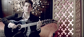
John Mayer - Half of My Heart 

Genre - The genre of the piece of music and the artist who has created the piece of music is acoustic pop rock. However the genre of the video the music is played with is a drama, the storyline featured in the video is one which the viewer would expect to see in a soap or in a drama film. The video features themes of love, heartbreak and family. Considering the genre something like a wedding is expected and also the fact that there was something wrong with the wedding. However an unexpected element of the video is the fact that the grooms location is actually known by the end of the video and not just left to never be solved. 

Narrative - the main storyline of the video is the fact that there is a wedding about to happen between a man and a woman, however the man doesn't show up to the wedding, leaving the bride and the rest of the family to clean up the wedding and locate the groom, while the groom is sat in a bar with a guitar singing about why he didn't turn up. The main themes of the video are Love, Family, Heartbreak and Relationships. TODOROV's 5 stages is seen in this video, 4 stages are seen in this video, the stages being equilibrium, disruption, recognition and attempted repair. The only main recognisable character is the artist who is playing the groom. The lyrics of the song link in well to the fact he is walking away from love for example 'I can't keep loving you, with half of my heart'.
Representation  - Men are shown very stereotypically in this video, for example, the fact that the man is the one that has walked away re-enforces the stereotype that men are bad at handling their feelings and run away from issues instead of confronting them. Also the male protagonist of the video is shown to have a lot of power as all he does for most of the video is sit in a bar but he has managed to cause a large amount of damage to peoples days and lives. The artist is constructed as being someone who has trouble with their love life, which links back to their actual personal life in the stop light, as John Mayer is well known for having a lot of and trouble with women. 
Visual Codes - The video is set partly in a church, which has connotations of Love, and also commitment, for some people this can be very comforting, but for others this can be very scary, both of there feelings are shown in this video. The other place the video is set is in a Bar, this is a stereotypical setting in music videos as somewhere someone would go when they are having troubles or want an escape from what is going on in their life, which is what John Mayer is going in the video. There are no obvious uses of block colour, but the lighting is used effectively, in the church it is very bright and well light, showing connotations of happiness however in the bar it is very very dark and dull, showing connotations of sadness and confusion. 

Technical Codes - The camera angles used on the male in the video show how he has a lot of power but is also feeling very vulnerable and confused, this is because a range of shots are used on him, such as high and low angles through out, this connotes a sense of confusion across to the viewer. The male is also shot from a distance many times throughout the video, showing how he is confused and also how he feels pressure and overwhelmed as to the viewer, the camera angle makes it seem like he is being watched or followed. The cuts in the video are going at a steady pace, not too fast or too slow, showing how despite the terrible situation that is going on, it may not be a shock or disaster to some people present, especially the groom. 

Audience - The audience of this video could be either males or females as the video doesn't contain anything that swings toward any particular gender, however the video is probably best suited to be watched by people over the age of 16 the video and the song both contain strong themes about love and heartbreak which you probably need experience in either area to full relate to or understand.